Bethanny's profile
Employee

Employee

 • 

5K Messages

 • 

53.3K Points

Thursday, October 20th, 2022 2:07 PM

IMDb Name Page Redesign

IMDb Name Page Redesign

Image


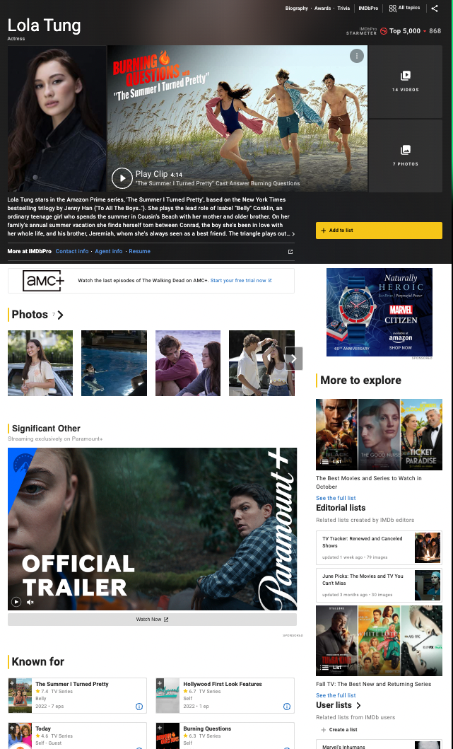
We are excited to announce the launch of IMDb’s redesigned Name pages! These pages are meant to make your IMDb experience easier and more enjoyable by providing better access to photos and videos, an upgraded view of an individual’s credits, and improved mobile navigation making it easier to view IMDb features on the go. These enhancements reflect changes suggested by IMDb customers, as well as our own in-depth research designed to enhance entertainment content, discovery, and navigation. More information is available in the FAQ on the help page.

We hope you enjoy these latest improvements, and thank you for continuing to make IMDb the world’s most trusted source for movie, TV, and entertainment content.

— The IMDb Team


English | Français | Deutsch | हिन्दी | Italiano | Português | Español

1 Message

 • 

62 Points

2 years ago

based on what i read above, there is no way to revert to the better design on the old pages? a preference?

can I at least filter some stuff out like videos? if I want stuff like that I should request it, not automatically there

that one thing kills the imdb app on say an iPad, auto plays video. I do not believe most people want that

maybe a account preference?

why do I now have to hit another link to see all of an artists roles? makes it harder to find things

Employee

 • 

7.1K Messages

 • 

176.6K Points

@sdbland​ 

based on what i read above, there is no way to revert to the better design on the old pages?

You might find our update from Wednesday helpful, particularly the point around the “All credits” view -> https://community-imdb.sprinklr.com/conversations/imdbcom/imdb-name-page-redesign/6351563ae7100d725d54c0bb?commentId=63878b2b038ef261b8f4b7fb

that one thing kills the imdb app on say an iPad, auto plays video. I do not believe most people want that

You can switch off auto-play on the IMDb website by clicking the three dots menu in the upper right of the video itself (same on the name pages; the setting applies to all future name and title pages which you visit on the same browser):

On the IMDb iPad app there’s an option in the settings to disable video-auto play (“You” menu in the bottom right, then the settings symbol in the upper right of that page, it’s the “Video” menu item):

Hope this helps. 

2 Messages

 • 

70 Points

2 years ago

Just the latest in the endless parade of "innovations" by people who change things because they're terrified their bosses will notice they have little real work to do.

Negative feature: harder to get the info I want. Positive features: none.

GET RID OF IT. 

Employee

 • 

7.1K Messages

 • 

176.6K Points

@misterjrthedYou might find our update from Wednesday helpful, particularly the point around the “All credits” view -> https://community-imdb.sprinklr.com/conversations/imdbcom/imdb-name-page-redesign/6351563ae7100d725d54c0bb?commentId=63878b2b038ef261b8f4b7fb

1 Message

 • 

60 Points

2 years ago

Since the employee who has been commenting in here has said that relative to the user base, very few people have complained about these changes, I'd just like to add my name to the list of people who despise everything about this design change. It's true that you can't please everyone with a change. I can live with the overbearing large pictures and autoplay video that will now greet the top of the page if you just let me see all credits of an actor/director/cinematographer/whatever without having to click any other button to do so. Do not bury this stuff in a sub menu. Do not conceal half the credits under a See More button. This is a database. Not a photo gallery. Let us see the data. When I go to someone's IMDb page, I want to see all of their credits on that page, no searching/clicking required.

Also, as I tried to post this, I found that I need a separate IMDb Community Sign In, despite being signed into IMDb already. If you want to know why so few people relative the overall user base are complaining, this unfriendly process to post a complaint probably keeps a lot away.

8.2K Messages

 • 

173K Points

@Gmurph​ 😀

Gmurph 
Joined Fri, Dec 2, 2022

- - -

This message board isnot part of IMDb
They had their own Boards but closed it down
sprinklr.com Needs a different account 
- - -

ACT_1
Wed Nov 30 2022
159,390,000 Users
plmoon
IMDb member since Wed Nov 30 2022
New user!
https://www.imdb.com/user/ur159390000/

- - -

Col_Needham
@ACT_1​
Correct, registered customers make-up only a fraction of our userbase.
IMDb has over 200 million unique visitors per month
(and that's visitors not visits, the latter being significantly higher).  
https://community-imdb.sprinklr.com/conversations/imdbcom/imdb-name-page-redesign/6351563ae7100d725d54c0bb?commentId=63878b2b038ef261b8f4b7fb&replyId=6387e1b00693e36e8a570bfa

Most IMDb Users and Visitors do not know to post their comments here

Add a Banner Ad top of all IMDb Name pages to visit here??

.

(edited)

248 Messages

 • 

17.6K Points

@Gmurph​ Actually, the autoplay video thing can be turned off. Just click the three dots in the top right corner of the video and de-select the "Play a silent video preview when available" slider. This selection actually carries across to all name pages too. This is a good thing, and show that user customization CAN be implemented, and that it is - so far sparsely - being done.

As such, @Col_Needham; we need more options like that one, that actually carry across all name pages, and that can make the page more bearable for those of us who DO have complaints about it, and which will also help a lot of the users who does not voice their opinions. Suggestions:

- For the picture section, an option to select the size of the pictures, or even turn them off all together.

- For the "know for" section, the same (size of the previews and whether or not to show it).

- For the credits section, options for whether or not one wants the list limited by the main professions or not (which currently requires three or four clicks to remove in order to see all professions), options to expand the credits under any given profession fully or not (so that those who wants it can get all credits automatically expanded always, without further clicks every time), and choices for spacing in the credits sections; let people select spacing between each entry, space between title name and year, etc., from a given set of options, where sliding a slider shows you the differences on the fly, letting you choose the one that fits your preference most

- And for the general title page, there should be selections for a dark mode, which is becoming a very common and useful thing on many sites these days, and slider options for how to show topics (as a left or right aligned menu, or just as a single button as now) and/or the option to customize which topics to automatically display along or instead of bio/awards/trivia.

Such customizations would help make the page better for all. Those who like it as it is now don't need to do anything, and those who have issues can with a few clicks choose a still modern layout based on new technology they prefer more that sticks along all name pages, instead of having to go through a laundry list of extra scrolling and clicks to get to what they want to find on each and every name page, and on each visit to it, as it is now.

I might also add that I was "invited" to view the new name page this summer, but at no point was I asked for opinions on it when I reverted back to the old view. It's quite common these days for sites to send out surveys, especially after a new design has been implemented, but I can't ever remember getting such from IMDb. I'd gladly participate in those, though. However, never having seen such surveys been made, I question your grounds for thinking most people like the new design, just because there are only a few people who take the time to find out how and where to sign up to voice their opinion and actually go through the process of registering in order to do so. Just because you still get the same amount of unique visitors to the page does not imply that most of them like the changes. Do you have any data about behavior and visits from frequent visitors from the past versus the same users now? Also, there is a big difference between a unique visitor who only visits the page maybe once a month to check out a specific movie or such, and the "super users" who use the page many times per day. But from your past comments it seem that you weigh both of these category of users the same. I'm sure the vast majority of unique visitors to the page belong in the first category, visiting the page only a handful of times per month; for them a few extra clicks that one time doesn't cause much uproar - if they are able to find what they're looking for at all, though: the "all topics" menu isn't very intuitive. As such, the opinions of those who DO use and care enough about the site to register here and talk about its various changes SHOULD be given a LOT of extra weight!

248 Messages

 • 

5.6K Points

@ACT_1​ "Most IMDb Users and Visitors do not know to post their comments here"

Or they don't care about every change on internet, they will adapt very fast, we live in a fast-paced world. 😜

45 Messages

 • 

1.4K Points

@cartman_1337​ thanks for the tip on the auto-play for video previews! That's a gem. I didn't even notice the three dots because I was busy scrolling away and to the information I was seeking.

Employee

 • 

7.1K Messages

 • 

176.6K Points

@ACT_1​ 

Add a Banner Ad top of all IMDb Name pages to visit here??

We already have something more visible than this — there’s a sticky banner at the bottom of every name page which stays in view as you scroll the page:

It stays there until dismissed.  The link leads to the FAQ at https://help.imdb.com/article/issues/GMWASETVPLJYXEZE which includes a pointer to this thread.   This is how most people are finding their way here:

How do I submit feedback or report issues?

To submit feedback, please add a comment to our Sprinklr thread

Hope this helps. 

Employee

 • 

7.1K Messages

 • 

176.6K Points

@cartman_1337​ Thanks for the detailed feedback. In terms of additional options, the team are reading the thread and weighing the feedback. Until the entire site is on the new technology it is easier to add options which apply to your current browser vs. ones which apply across browsers and systems. 

And for the general title page, there should be selections for a dark mode, which is becoming a very common and useful thing on many sites these days

This is covered earlier at https://community-imdb.sprinklr.com/conversations/imdbcom/imdb-name-page-redesign/6351563ae7100d725d54c0bb?commentId=636b2d99eda63e18141cb821&replyId=637156045ce5a035bfeb53de 

I might also add that I was "invited" to view the new name page this summer, but at no point was I asked for opinions

The beta opt-in / opt-out banner included a link to the beta Sprinklr feedback thread and we followed up with specific research sessions with a representative sample of power users and contributors. Major changes which were made are covered in our earlier reply at https://community-imdb.sprinklr.com/conversations/imdbcom/imdb-name-page-redesign/6351563ae7100d725d54c0bb?commentId=63618fffeda63e18141b9b5b&replyId=63625232eda63e18141ba6a3 (you may need to scroll to see my reply). 

I question your grounds for thinking most people like the new design, just because there are only a few people who take the time to find out how and where to sign up to voice their opinion

We are not saying this, sorry, I covered this yesterday at https://community-imdb.sprinklr.com/conversations/imdbcom/imdb-name-page-redesign/6351563ae7100d725d54c0bb?commentId=63878b2b038ef261b8f4b7fb&replyId=638889410693e36e8a57290a 

Do you have any data about behavior and visits from frequent visitors from the past versus the same users now? Also, there is a big difference between a unique visitor who only visits the page maybe once a month to check out a specific movie or such, and the "super users" who use the page many times per day

Yes we do, we have extensive metrics on customer behaviours as also noted earlier (and I encourage you to read our responses across the whole thread if you have not done so already).  We have the usage and engagement data from around one million beta-testers across the summer and the same from the updated version which has been gradually rolling out over the last month or so (which was being used by over one hundred million customers until the full launch on Wednesday). We would not have launched if our key success metrics were not positive.  People who have not yet given enough time to become accustomed to the power and flexibility of the new pages may show up here and declare it a disaster but the overall metrics paint a story of success (again covered across our replies in this thread).  This is a good example of a view which was not even possible on the old pages -> https://community-imdb.sprinklr.com/conversations/imdbcom/imdb-name-page-redesign/6351563ae7100d725d54c0bb?commentId=6354b38bb393e26a279b6b23&replyId=635cf7dd5c8f315ee267bb52

the "all topics" menu isn't very intuitive.

Are you still on title reference view?  Our points on this are also covered at https://community-imdb.sprinklr.com/conversations/imdbcom/imdb-name-page-redesign/6351563ae7100d725d54c0bb?commentId=63878b2b038ef261b8f4b7fb&replyId=638889410693e36e8a57290a — there are many different use cases for accessing IMDb and we have carefully designed and tested what is shown by default and what is available via menus and links. It is always a compromise, but we are happy with where this landed.

As such, the opinions of those who DO use and care enough about the site to register here and talk about its various changes SHOULD be given a LOT of extra weight!

All constructive feedback is being read & weighed by the team and IMDb is always evolving based on customer feedback, however, complaints which are essentially “turn it off” are not particularly actionable given all of the benefits which the new pages have over the old, and the fact that the old tech is outdated and needs to be retired.  Besides, the “All credits”view is pretty close to being able to access the old view anyway only with extra episode details added and all of the non-credits data removed.  There’s even an unofficial browser script posted in this thread which can swap that view partially in by default. 

Hope this helps. 

(edited)

10.6K Messages

 • 

224.9K Points

In a way, the IMDb name page redesign isn't so much the problem as the way the new platform upon which it (along with the IMDb title page redesign and the IMDb home page redesign) is built functions altogether. I've complained before about how slow and inefficient the "all topics" feature is (on the IMDb title pages), and somehow I get the feeling that the development team either didn't read it or simply don't care to improve the underlying new software. That's really the crux of this problem. Then again, I'm literally the only person here who is actually complaining about the performance of new platform overall in and of itself, so of course my thought are going to set aside.

248 Messages

 • 

17.6K Points

@Col_Needham​ Thanks for the detailed feedback. In terms of additional options, the team are reading the thread and weighing the feedback. Until the entire site is on the new technology it is easier to add options which apply to your current browser vs. ones which apply across browsers and systems. 

Thanks for your reply. I've come to realize that browser-stored options are probably the easiest way to implement changes, and I'm fine with having to select options multiple times across different browsers and computer, as long as they get stored there from then on, until something forces a reset of cookies etc. Which is why my suggestions are aimed towards options that can be selected and viewed directly on the name page, and not through the user options page. Such options I would expect to be stored per browser, while options stored on the user profile I'd expect to show up everywhere.

Are you still on title reference view?

Of course I am. I may not be the most prolific contributor, but I tend to do several contributions per month, and both for assessing already contributed data and for overall look, feel and access to the data I generally want, the title reference view is required. I cringe whenever I visit the site through a browser I haven't logged in to... I, like many other in this thread, value effective design over style/beauty, and hate anything new added that suddenly requires several more clicks and scrolls to get to where one wants. Though I understand that I may be in a minority there, and that maybe even most users prefer a "beautiful" design over an effective one, going forward I really don't understand why you can't cater to both. Making a site "skinable", without the use of third party scripts and such, would be both modern and user friendly, and can also work across all types of devices. You can make the default view as stylish and - from my point of view - clunky as you wish, as long as you provide me with a few customizations that can also make it effective, that I, as an advanced and frequent user, would prefer over the default. Default works for most, but advanced users tend to want ways to modify their experience in a more effective way. And it is quite customary in these days to implement such options, and not just have "one view for all, like it or not"...

All constructive feedback is being read & weighed by the team and IMDb is always evolving based on customer feedback, however, complaints which are essentially “turn it off” are not particularly actionable given all of the benefits which the new pages have over the old, and the fact that the old tech is outdated and needs to be retired.  Besides, the “All credits”view is pretty close to being able to access the old view anyway only with extra episode details added and all of the non-credits data removed.  There’s even an unofficial browser script posted in this thread which can swap that view partially in by default. 

I'll admit that my first comment in this thread was pretty close to the "please turn it off" variety. But I realize that that is not likely to happen. That's why both my first comment, where I also tagged you, and the one this is in reply to now, have several suggestions about how the current view can be customized for a more effective design that will cater to more users going forward.

45 Messages

 • 

1.4K Points

While I don't know the specific reasons why, I too find the pages slow to load, especially on my phone and they are fairly graphic heavy. (When I find another example, I'll try and remember to post a screen cap) but one thing I find really annoying is large graphics, apparently unrelated to the person I'm viewing, trying to lure me to some other IMDb content. It was one of the issues I had when first encountering the new name pages on my phone and as I tried to scroll past I was diverted to this other, totally uninteresting content.

Could this be because my entire screen area is basically a link?

edit: I'm not using the mobile app -- I view everything on my phone through a browser.

(edited)

45 Messages

 • 

1.4K Points

@cartman_1337​ Your suggestion of skins or the like is excellent though I'm guessing they want to migrate everything to the new structure first. I think recognizing the vast different users groups is important to a site like this. Imagine if an automaker only sold one model in any color you wanted, as long as you want black ... How many industries survive on the one size fits all model?

45 Messages

 • 

1.4K Points

(I found a page, made screen caps, but when I try to use the add image button in the entry field toolbar, I end up at a blank page. I also don't seem to be able to drag and drop the image into this text entry field. Then when I use my back button, I'm taken to a different page of this thread and have to hunt for where I was making the comment. Again, this forum software is frustrating! I'm going to post this and see if I can find another way to add the graphics.)

Okay, all I can figure out how to do is link to examples saved on postimage

the top of an actor's name page

the type of content I find annoying on an actor's name page

I'm pretty certain that "more to explore" type of unrelated content was showing up before the credits earlier in the week. I don't believe it was actually a more to explore widget, but something else.

I object less to this being included at the bottom of the page though clearly it slows down the page's load, especially if one is moving back and forth, say to read trivia, then return to the name page to read something else. This is what I found intolerable when I first encountered the revamped name pages on my phone (in a browser).

(edited)

Champion

 • 

4K Messages

 • 

243.8K Points

@jeorj_euler​ That's an interesting insight. To be honest, considering that it took me months to adjust toprevious IMDb update, I'm kinda shocked how I feel myself at home with the current version already. I understand that I am a minority in that aspect, though. 

10.6K Messages

 • 

224.9K Points

But I'm complaining about how slowly all pages on the new platform load, Mykola. In the desktop browser that I use, often the "all topics" menu won't even load, until after multiple clicks! The choice to make the JavaScript as bloated, inefficient and gluttonous as possible (by making it responsible for constructing half of the DOM elements on the entire page) is to blame for this nuisance effect! Why would somebody do this?! Well, such a thing is somewhat common nowadays on the world-wide Web. Google, Twitter, Instagram, TikTok, Wix, among others (based out of North America), are also some of the greatest offenders in this regard.

10.6K Messages

 • 

224.9K Points

(Come to think of it, Sprinklr is another one of them. You might not really notice the effect of the bloat unless loading a gigantic thread.)

1 Message

 • 

60 Points

2 years ago

The previous design had horizontal scroll on an actor's past credits, which showed their past movies/tv show in a larger icon. This made it easier to quickly browse to see where you might know them from.

New design has tiny icons. Would also love an option to revert to the old design.

10.6K Messages

 • 

224.9K Points

Just to note, Emilie here is describing the way the IMDb name pages looked on the last generation mobile rendition of IMDb. I also agree that the way the "known for" section used to look and function (on the presentations for both the mobile and desktop) was more suitable than what we have now with all the empty space within each box item in the particular section. I will have to create a script that condenses it in such a way that less scrolling is needed to view the items.

8 Messages

 • 

166 Points

Could that be written as a bookmarklet that you could share with us? A bookmarklet format would be the perfect method to resize or suppress images on the pages, and so simple to add and run. Thanks

10.6K Messages

 • 

224.9K Points

Usually I start with a bookmarklet and then adapt (copy and paste) the code into to a monkey script that would run automatically.

2 Messages

 • 

72 Points

2 years ago

So as far as I can tell, this updated format only occurs when you're looking at an *actor's* page, and not the page of a film. Why in the world would you take an effective interface, working perfectly at doing two jobs, perhaps even streamlining use of the site due to it's lack of complication. And then here we are now, changing half the site into a convoluted mess and leaving the previously successful code intact, just underutilized. What a joke. 

10.6K Messages

 • 

224.9K Points

Hi, Raphaelraven​. Welcome to the IMDb Community forum! Do you use title reference view? If not, then I'm confused about your statement, "this updated format only occurs when you're looking at an *actor's* page, and not the page of a film."

Employee

 • 

7.1K Messages

 • 

176.6K Points

@Raphaelraven

And then here we are now, changing half the site

It sounds like you are (perhaps accidentally) opted into the alternate view of title pages which is specifically aimed only at top data contributors who need to be able to compare the IMDb listing with the end credits of a title.  If you visit the Content Settings page, uncheck the box in the Contributors section and press the submit button, this will restore the title pages to the standard view which is compatible with the new name pages.  The title pages were updated in the summer of 2021.

The new name pages are part of a design & technology upgrade which is being launched gradually across different page types and is aimed at better scaling IMDb for the future.  Other pages which already launched beyond name and title include the home, what to watch, video, and photo pages.

You might find our update from Wednesday helpful, particularly the point around the “All credits” view -> https://community-imdb.sprinklr.com/conversations/imdbcom/imdb-name-page-redesign/6351563ae7100d725d54c0bb?commentId=63878b2b038ef261b8f4b7fb

Hope this helps.

1 Message

 • 

96 Points

2 years ago

If imdb reaaly cared about us users they would read the feedback here and realize with 99% negative feedback that there is something wrong with the new page layout and fire / replace the designers , in any other industry if engineers screwed up like this they would be fired !

3 Messages

 • 

134 Points

@Sandy​ I'm using IMDB pretty much daily, and I haven't seen any petitions regarding design.

I did see something about a new design, but I wasn't interested in that (I tried it, hated the hell out of it), so I reverted back to the old fashioned one. Maybe there was some info about it that I missed, but I think I would've remembered a questionnaire or petition about it.

I think the majority of users most likely ignored it, or like me tested & rejected it and kept on using it until it was too late.

Had they had a pop-up asking its users what they thought, or embedded in the pages (better), I think they'd gotten a better feedback, and we might not have needed to post a lot of it here, like dogs barking at the moon.

I'm willing to bet that the ones that did notice any questionnaire (Not everyone sees or thinks the same things) perhaps might have given positive feedback.

I myself don't care about the design (unless, like now it's very ineffective & practically useless), as I'm using the site to check up on actors, movies, trivia and bios and such.

Not the fluff around it. I also like to check up on celebrity news, but apparently, gossip and reality crap is considered news. I actually only visit to see if someone have died or actual news.


But, very much like that content, it's apparently more important to focus on graphical design (or, for this argument's sake, content, gossip) rather than its intended use, namely actual useful stuff, like news.

For some reason some people see it fit to hide away useful information. Apple with their minimalist design (like no indicators to show if the PC's still running, HDD activity etc), and Microsoft to follow with their hiding of essential settings in menus, and this is pretty much how our society seem to be evolving.

We spent the later part of the 20'th century building communication platforms, industries, and the last decade is when things started to go downhill IMO, at least when it comes to services and availability of things.

Man's become a bureaucrat, and even the simplest of things, like changing a light bulb requires delegation, instead of getting off his/hers own ass and do something about it.

Call a company or public service and you end up with some automated voice service.

People are getting out of touch with each other, more distancing, focused on monetary issues over people, and sell sell sell.

As for the design here on IMDB, I'm guessing it's a younger generation that handles it who don't care about practicality over usability, and those in charge probably don't use it (site) the same way as us who're in here for specific details, and they think it looks good and somehow that justifies the inadequacy of the usefulness.

Everyone's different in what they like or don't.

Personally, I like to use the keyboard & command buttons, small icons, list-view, others rather want to use the mouse to click on a button right next to a password field (instead of just pressing Enter), large-as-possible icons that swallows the entire window and rely on the icons to find what they're looking for (large thumbnails in other words).

There are good and bad ways of being effective, and many I think share this point of view, but far from all, and that's why we have this diversity, and sadly it tends to trump the minority as, for some reason the bar for what's a feasible and (acceptable) useful design/function, keeps getting raised.

Another few years from now, there's probably going to be another revamp of the site, and I'm betting it's going to be even more awful than what it is now.

2 Messages

 • 

70 Points

2 years ago

can i revert back to the old look of imdb. the new look is terrible.

Note: This comment was created from a merged conversation originally titled new look

1 Message

 • 

62 Points

2 years ago

Damn this new design is horrible.  It's just plain hard to use. 

The images in the list of projects are too small to be truly useful and destroy the readability.

Why do I have to click "view all" when I probably wanted to view them all to begin with?

Did you increase the size of the photos?  (Hint: People do not go to a movie database to view pictures, I go there for data).

"Known for..."?  Yes.... there's a list of credits below that which gives EVERYTHING they did.

What were you thinking?

45 Messages

 • 

1.4K Points

I wonder how many people look at the page and only care about "Known for" and maybe the bio. I know one big thing I missed on the new name pages is birthplace moving way down the page. Not a big deal now that I know where the information is located, but an initial disappointment. While birthplace isn't important, I find it might add insight to the strangeness of an accent or explain why I haven't encountered this individual before

12 Messages

 • 

190 Points

2 years ago

New version is HORRIBLE for printing name pages!!!!!! It almost triples the amount of pages, ex. a name page that would normally be printing at 5 pages is now showing printing at 15 pages because it expands the images and video thumbnails aggressively...at $.10 a page, $.50 to $1.50 is excessive!!!!!!


Too bad on not having the option to switch back to the previous version, I do recall back in the day users were able to view different versions, I guess out with the old and in the new, as they say, phooy!


Please make the previous version also available, as performer pages are needed for printing for CDs (casting directors) and producers, etc!

Note: This comment was created from a merged conversation originally titled New Version

Employee

 • 

7.1K Messages

 • 

176.6K Points

@bounce_out​ You might find our update from Wednesday helpful, particularly the point around the “All credits” view -> https://community-imdb.sprinklr.com/conversations/imdbcom/imdb-name-page-redesign/6351563ae7100d725d54c0bb?commentId=63878b2b038ef261b8f4b7fb

1 Message

 • 

62 Points

2 years ago

I think it would look better with a few tweaks. 

- Leave off the pictures, it makes it look too noisy.

-Change the Titles to blue instead of black.

-Put "TV Series" behind the title instead of on a new line- maybe in parentheses.

-Expand the listing by showing the episodes and making them links.  That will save a click and a popup.

A good layout example of this would be something like this.

https://www.imdb.com/name/nm0687189/fullcredits?ref_=nm_flmg_sort_text_view

Honestly, my eye can skim the old style a lot faster than the new "modern, clean presentation of information which works for casual users", as you call it.

Just my two cents. 

T.

2 Messages

 • 

70 Points

2 years ago

I’m a longtime IMDb user. Only now just made an account to make this comment. This new redesign is terribly structured, visually it’s confusing and makes a once simple to navigate website visually incoherent. The first thought to enter my mind was “how and where is the info I’m looking for?” Many apps and websites change over the years and make horrible updates that ruin a fine thing. Please, reconsider your update, there was no need for this. 

10.6K Messages

 • 

224.9K Points

Hi, Woods. Your feedback is appreciated. Did you ever find what you were looking for?

2 Messages

 • 

112 Points

2 years ago

Before your 'upgrade' where actors & actress were not jumbled up. I use imdb to search for actors & actresses by name & put them in my spreadsheet. Simple is better always.

. I don't like the way somebody changed the layout.

Note: This comment was created from a merged conversation originally titled How do I go back to what imdb used to be?

10.6K Messages

 • 

224.9K Points

But notice how the look of IMDb name pages is analogous to the look of IMDb title pages? (That is, sans application of title reference view.)

8 Messages

 • 

166 Points

2 years ago

 Is anyone from IMDb web design reading these posts?

The consensus is that we DO NOT LIKE the new format and

we want an option out!

Thanks

Employee

 • 

7.1K Messages

 • 

176.6K Points

@rhgrafix​ 

Is anyone from IMDb web design reading these posts?

Yes, the team is reading, and there are many replies (mostly from me) across the thread. You might find our update from Wednesday helpful, particularly the point around the “All credits” view -> https://community-imdb.sprinklr.com/conversations/imdbcom/imdb-name-page-redesign/6351563ae7100d725d54c0bb?commentId=63878b2b038ef261b8f4b7fb

1 Message

 • 

66 Points

2 years ago

Thank you for more than 20 years, apparently you only understand the value of something when you lose it :(

Suggestions:

1. Please open the old and the new design as options for a while at the same time and then see from the statistics which one is used more. This would solve the previously commented problem of only a couple of hundred complains and hundreds of millions of users are happy. 

2.  Or open the old IMBD for paying customers. That could make some money for you. 

2 Messages

 • 

92 Points

2 years ago

As others have noted, the redesign is a catastrophic mess. If your goal was to get me to create an IMDB account (and thereby get my email address) in order to complain about this laughably bad redesign, then job well done. Who decided that breaking out credits into past and upcoming was preferable to a simple, easy to read list of all credits? It takes more clicks to get the information than it did before. There are redesigns that are frustrating at first and take time to get used to and then there is this. This is bad. Someone needs to take a step back, acknowledge the valid criticism the redesign is getting, swallow their pride and admit this redesign was perhaps change for the sake of change or someone trying to justify their job at IMDB. 

10.6K Messages

 • 

224.9K Points

Well, the underlying JavaScript bloat that is shared in common by name pages, title pages (title default view) and the home page is vastly worse than designs themselves. I get the feeling that the developers aren't going incorporate any performance upgrades before it comes time to retire the last generation platform (as seen in title reference view, "all credits" view, filmosearch and various subpath pages to title/name pages) entirely, so invariably the actual catastrophic mess will be realized at that point. Maybe those of us concerned about this ought to request that there simply exist a "no JS" rendition of IMDb?