


Employee
•
2.3K Messages
•
40.7K Points
Title pages — new version available for sneak peek
IMDb is working on updates to the Title page. The new version of the page is mobile-responsive, meaning all features are available on devices of all sizes, and has a modern look and feel — otherwise it maintains all the functionality of the current page, though some features have moved on the page.
The new version of the page is available to a limited group of fans during a beta period. During the beta, some features are still under construction, and you may encounter bugs.
UPDATE: now available!
- Recently viewed
- Related News
- Awards & Top 250
- More like this
- “Character” links are now included in the Cast section.
- The Episodes section now includes a link to all top-rated episodes for TV series.
For more information, check out this Help article.
NixIce
1 Message
•
60 Points
5 years ago
Slight complaint: the new Director/Writer/Stars box is unfriendly to browser action of highlighting text. It doesn't act like a web page anymore, it acts like a mobile app.
I would usually come over to IMDB and that top-line info was super handy in online conversations. "Who directed that?", or "What was the name of the co-star in suchandsuch?", or "How do you spell that name?", that was all top-line info and easy to copy-paste into a post or an email.
In the new design, this is currently difficult. Because the fields in this module are now designed around mobile/responsive use, clicking this box to highlight inadvertently triggers a click instead of a drag-select. (Also, "Copy as Link Text" seems to be disabled, making a right-click not work as an option either.) You can drag the cursor from somewhere off the module and get the text, sort of, but you have to take all the text in that case because it doesn't let you highlight just the reference you want.
Lower down the page, the Cast module works just fine for Highlight selection, but then the second Writer/Director/Crew box has the same problem of being one big app-style box instead of a collection of links.
Hope this can be resolved. Best of luck with the redesign -- there are things I like and don't like about the look, but it's the functionality I care most about, so I'll leave it to others to comment with reactions to the look (I've been through web redesigns and it's a lot of work to please so many people,) as long as I can use the site as usefully as always then I wish you luck with the refresh.
0
hughlilly
1 Message
•
60 Points
5 years ago
On the new design, the Country of Origin data point ought to be displayed alongside release year and runtime underneath the title at the top of the page.
(Sorry if this has been suggested elsewhere; I couldn't see a way of searching this thread.)
0
ozako1514
1 Message
•
60 Points
5 years ago
The metascore is not available on the new version like it was on the old shown in the image, please add it next to the audience rating, it's so important to many.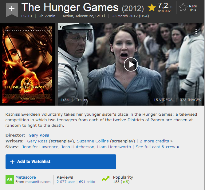
(edited)
3
racliff
31 Messages
•
456 Points
5 years ago
It's been 3 months now that this sneak peek has been available. And yes IMDB has fixed some bugs to a completely unnecessary change. How many people does it take to get the 'powers that be' to understand we don't want this picture-centric garbage layout. How many more comments are needed? Does it take a national riot, setting fire to police cruisers before anyone gets it. A large number of us want the current layout to remain, and are willing to comment on it ... and everyone else is just getting too tired to complain about it.
0
Allen99
3 Messages
•
80 Points
5 years ago
The new layout has some major issues, some of which go against most common web development "rules"
For example giving users the most critical information they seek in one at a glance place, WITHOUT them having to scroll, doing this stops people leaving the site.
The other disaster is designing the new layout with developers having 30 inch screens, this makes them design sites for bigger screens, believe it or not, the most common screen by multiples of the nearest other screen is the 15" laptop, the new layout of IMDB looks awful on this.
The layout suffers from the disease of "too much whitespace" and designers using too many widgets, sometimes just because you can, does not mean you should.
Consider the movie Avengers: Endgame (2019), in the old format I could see all the pertinent information at the top without scrolling,
Avengers: Endgame (2019)
if I were to improve it I would have put the 8.4 rating along with the above right after the year or before the PG-13
But no, in the new layout we lose the Action, Adventure Drama tags and they are put below images, they are not text but in ovals that take us screen estate.
If you want people to browse and engage with your site you need to meet their needs, that all starts with the 2 second decision, is this movie something I want to know more about?
If I have to scroll I just make the decision on the limited information and leave, but if the information tells me that this is a genre that I like, say Action or Rom Com or whatever, then I read more. That is also why 8.4 rating should be there close to the title not orphaned over to the right.
Why does it matter? Well if I read more I am more engaged with the site, I stay on longer and that means more advertising attention and conversion for the revenue generating aspect of the site.
I find the rest of the page disjointed and un-intuitive.
Most people will just leave and head over to Rotten Tomatoes or Google, others like me will just delete the IMDB bookmark and go elsewhere.
This is a great opportunity for anyone else (Netflix) to build their own competing site.
1
0
Allen99
3 Messages
•
80 Points
5 years ago
https://community-imdb.sprinklr.com/conversations/imdbcom/problem-with-new-imdb-layout/604787bb32c631317bb7c76e
0
MykolaYeriomin
Champion
•
4.1K Messages
•
245.2K Points
5 years ago
Some notes after switching to new design almost instantaneously and using it for several months:
-The absence of normal hyperlinks in many of the areas is somewhat confusing;
-It takes more time to scroll through the page;
-It took me quite some time to discover "All topics" button;
-In my humble opinion attributes on languages and color are necessary to display on the title pages to prevent confusion and misguided edits, especially considering I am unable to find whether attributes for languages are even available without accessing the edit mode;
-Random glitch sometimes switches to mobile version of IMDb (m.imdb.com) when accessing some areas.
(edited)
0
debles99
2 Messages
•
70 Points
5 years ago
The whole new setup is totally a waste of time. There was nothing wrong with the way it's always looked. I still don't see any reason to change everything. Wake the hell up!
0
sheilaberke
1 Message
•
60 Points
5 years ago
I don't see Critic Reviews, only User Reviews. Will this be added back?
1
nav
6 Messages
•
330 Points
5 years ago
Its been 3 months and it still looks like some dumb down smartphone app. Nothing has changed based on our feedback.
0
TM1698
2 Messages
•
80 Points
5 years ago
I found I immediately missed the coloured box around the metacritic score — is there any way we can get that, rather than just the small number tucked away in the corner?
2
spiritchaser
3 Messages
•
80 Points
5 years ago
I use this site a lot to identify cast members in some TV shows and movies. In the old version the cast list is on the main page of the episode. In the new version you have to click to another page to get the cast list. I would prefer to get both the cast list and other episode info on one page rather than having to click back and forth between two pages.
0
spiritchaser
3 Messages
•
80 Points
5 years ago
I use this site a lot to identify cast members in some TV shows and movies. In the current version the cast list and other info are all on the same page. In the new version you have to click to a different page to get the cast list. I would prefer to get both the cast list and other episode info on one page without having to click back and forth.
2
TeJe78
7 Messages
•
120 Points
5 years ago
The new update make some names disappear from the side. Actors and more info will be hidden, by the new layout.
Like the list of actors on His Dark Materials. To see all the actors, the list on the top disappear from the screen.
The background image too big, and steal the space, it looks like.
Btw, I use mostly mobile, but always in fullweb. Checked the page on laptop and the same issue there too.
Click on "see full cast", and some names is behind the layout, as on His Dark Materials.
Also the background take too much space, and is not so much needed, for text. It was better before. Hope to see it as it was.
P. S. I did some mistake on my first post earlier today, so I deleted the first one, and added it here again. So just merge my post where it was merged earlier.
1
Adrian28
1 Message
•
68 Points
5 years ago
We want the compact design to stay.
The new design its ok, but only for touch screen device users. On PC, the new design its too big and spacious around every object.
Dont force the new design on us and, like the front page, and let us keep the compact design mode. (or maybe minimally remake the compact design with proper dark mode)
0