Bethanny's profile
Employee

Employee

 • 

5K Messages

 • 

53.3K Points

Thursday, October 20th, 2022 2:07 PM

IMDb Name Page Redesign

IMDb Name Page Redesign

Image


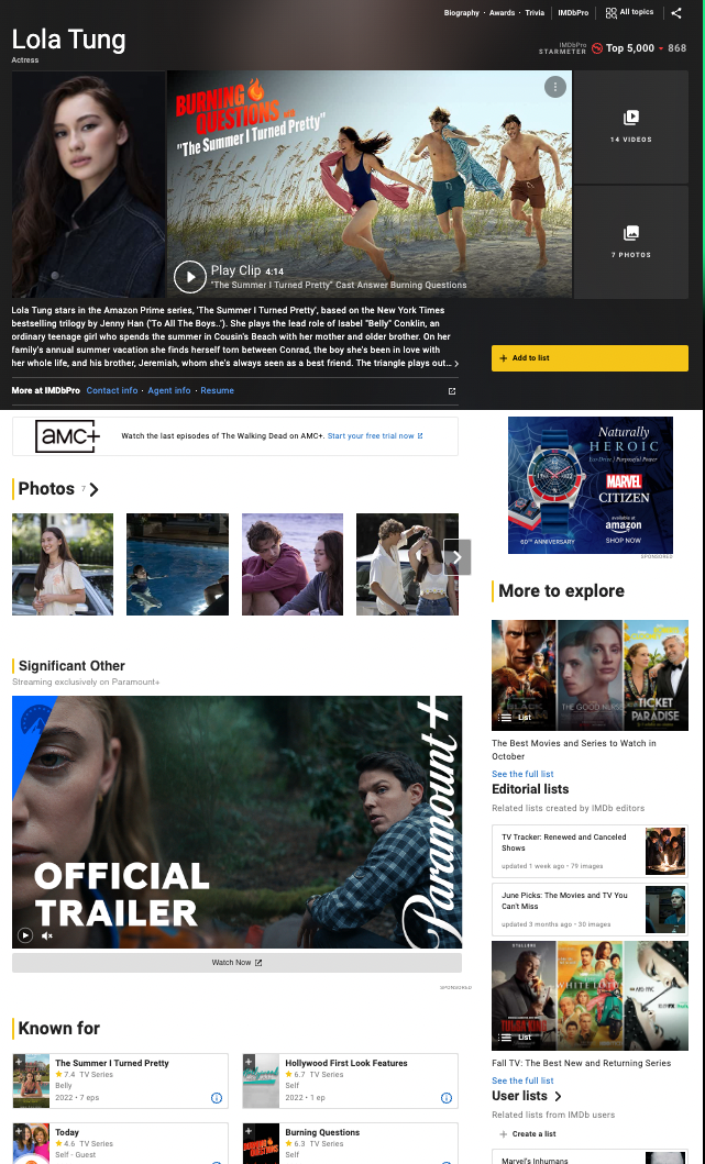
We are excited to announce the launch of IMDb’s redesigned Name pages! These pages are meant to make your IMDb experience easier and more enjoyable by providing better access to photos and videos, an upgraded view of an individual’s credits, and improved mobile navigation making it easier to view IMDb features on the go. These enhancements reflect changes suggested by IMDb customers, as well as our own in-depth research designed to enhance entertainment content, discovery, and navigation. More information is available in the FAQ on the help page.

We hope you enjoy these latest improvements, and thank you for continuing to make IMDb the world’s most trusted source for movie, TV, and entertainment content.

— The IMDb Team


English | Français | Deutsch | हिन्दी | Italiano | Português | Español

4 Messages

 • 

110 Points

2 years ago

Reference mode still works on movie titles but appears broken currently for actor pages.

Note: This comment was created from a merged conversation originally titled Reference mode broken for actor pages?

Employee

 • 

7.1K Messages

 • 

176.6K Points

@patrickoriley​ Sorry, but there is no reference view for name pages — that is a title page only feature aimed at IMDb contributors updating credit data directly from the on-screen credits.  

We are partway through launching an update to our name pages though, please see the FAQ at https://help.imdb.com/article/issues/GMWASETVPLJYXEZE/

Hope this helps.

4 Messages

 • 

110 Points

Might an option to view the old fashioned name pages become available in the future? It's honestly something I'd be willing to pay a subscription for since I use the site for research purposes and the new design is not ideal for that.

Employee

 • 

7.1K Messages

 • 

176.6K Points

@patrickoriley​ No sorry, it is not practical to rebuild a 12+ year old design at least.  The new page has significantly more sorting / filtering options than the previous version though, so if you could explain what you are seeking in your research, we might be able to show you how to achieve the same effect (and more) using the new pages?

Also, see our reply above regarding “Text view of credits” but this is not supported as a default view. 

4 Messages

 • 

110 Points

The "text view of credits" is exactly what I would prefer to see by default. I understand that is not the plan, but I can still access what I need for now. Thank you.

248 Messages

 • 

17.6K Points

@Col_Needham​ Well, this abomination finally hit my part of the world just now. Not that the previous version was much better, but this new page is slow and heavy (gets stuck for several seconds every now and then), you have to scroll through a couple of screen-fulls of bloated picture, trailers and useless "known for" information before you get the the useful bits, and even then for prolific people the sections are not even fully listed. However, the listings themselves are not as bad as I feared they would be, and the filtering options on top have some good features.

Based on previous messages I realize you don't care much about this opinion, but I hope you'll at least consider this little suggestion which I think would please those of us who DO wish there was a "reference view" for name pages. The thing is; you've practically got it already; the "text view of credits". You've also got user preferences under account settings, where title reference view can be activated, and such.

So my suggestion is this: just make an option under the already existing (yet currently mostly useless) "Name pages" section of content settings under account settings to automatically open the text view by default. For most of us wanting a reference view, the credits are what we come for, so in the cases we come for more clicking once on the name on the top of the screen to open the full view is a lot more convenient and friendly than having to click page down a couple of times, then the filter button and then the link to the text view.

I can't really see that implementing a simple option for this to a view you already have can be much work, nor counter-productive for your development of the site. After all, catering to more people with various view preferences for advanced users is usually considered good policy, as far as I can understand.

Of course, if you would consider even taking it a step further than that, I have this little wish list about user selectable name page content settings, in addition to the current movie/TV split settings and number of episodes to show:

- Like I said; an option to open text view by default

- An option to always expand ALL credit sections by default, so that you don't have to use even more clicks to expand each section

- An option to hide trailers and other heavy stuff for users with slow connections

Ideally I'd like to see the text view page expanded slightly with a link to the person's bio, awards and pictures - but kept to an absolute minimum of page usage. But like I wrote above, even as it is now getting directly into this view to get ALL the credits quickly and neatly, and having to do an extra click to get the other stuff, is far preferable than today's reality where getting all the info I DO want requires half a dozen extra clicks and tweaks...

580 Messages

 • 

13.3K Points

I was about to make the same points about the "text view of credits". This is almost the same layout as the previous list of credits. So what's special about this page and the way it is generated, that's different to the previous page and the code to generate it? How come IMDB are happy to supply and maintain the "text view of credits" page/code whereas they weren't happy to maintain the old page/code. 

Since a page exists, why not go the extra small distance and make it a user-selectable option in the user preferences - the same place where (title) reference view is selected. Do that and I think everyone would be happy, and we'd stop moaning ;-)

OK, there may be some small details that it lacks, compared with the previous page layout, but it is a considerable improvement over the modern format for "serious" users of the site as opposed to casual browsers of it. I can live with any small deficiencies that it may or may not have - it's good enough to be my default name view. Unlike the new page format, it is actually usable and gives complete information in one place.

I know that not everyone will like the old text display. But that's not the point: you'll never please everyone with one product, so the sensible approach is to add the new format for the people (maybe the majority) who prefer it, but not to remove the old format for those who rely on it.


I still don't understand why "text view of credits" is OK, but the previous name page format was not. They look very similar. If "text view of credits" is generated with new code, then that shows that updating the code did not mandate a new page format, and that similar new code can generate either format according to use preference.

(edited)

10.6K Messages

 • 

224.9K Points

Kind of relates to why I brought up name reference view. When it was retired, it wasn't too much of a problem, since the last generation platform already had a system that loaded a comprehensive list of credits upon a single page load, but now that is gone.

Champion

 • 

5K Messages

 • 

117.9K Points

@jeorj_euler​ 

Text View is close to name reference view.

See the All Topics menu, lower left corner.

3 Messages

 • 

80 Points

Test view is one step down when it doesn't need to be. If the goal is to force the user to see a page they don't want before the one they do want, a page that's well hidden, then it's a success.
If the goal is something user friendly, then it's not.

10.6K Messages

 • 

224.9K Points

O! Thank you, bderoes. I don't know how I missed that particular piece, maybe because it is at the bottom of the list of sorting options, or something. Indeed, the outcome of clicking the button or hyperlink leads to a distinct sub-path public URL from the base-path public URL, e.g. https://www.imdb.com/name/nm0000033/filmotype is the URL to the text-only version of the IMDb name page for Alfred Hitchcock. That is quite a lot like reference view sans respective samples of the mini bio, photo gallery, video gallery and "know for" listing. Still useful, nevertheless. By it being its own public URL with a format in a uniform pattern, the redirection process can be automated. Well, hopefully, IMDb developers will make it so that we can customize how any page template respectively looks to us when we're into the system.

Employee

 • 

7.1K Messages

 • 

176.6K Points

@martin_695862​  Thanks for the additional questions …

I was about to make the same points about the "text view of credits". This is almost the same layout as the previous list of credits. So what's special about this page and the way it is generated, that's different to the previous page and the code to generate it?

This is because the text view is still generated by the old software; pages and systems are being migrated gradually over time. The “text view” will eventually be replaced by an equivalent page generated via the newer software (which to be clear, will still show all credits, including all episodes, and nothing else — just as this current old technology version does).  

Since a page exists, why not go the extra small distance and make it a user-selectable option in the user preferences

As we wrote earlier in this thread, this is because the “text view” only contains the credits and nothing else, so it is not suitable to use as a landing page, sorry.  Adding new preferences which bridge the old and new technologies is not easy, especially for a limited time benefit.   We could revisit this (and other personalisation options) once every page on the site is on the new technology if there’s enough demand.  

Hope this helps.

262 Messages

 • 

8.2K Points

2 years ago

I haven't seen any changes to the name pages so far. I will need to see the page set up before I can give feedback. 

10.6K Messages

 • 

224.9K Points

Don't you remember the transition from the previous IMDb home page design to the current one? It's the same situation. (Likewise with the IMDb title page redesign.)

2 Messages

 • 

70 Points

2 years ago

One of my favorite options was to search people and then rank their work by IMDb rating.  It seems this is no longer possible?

Note: This comment was created from a merged conversation originally titled Can't rank people's credits by IMDb rating

22 Messages

 • 

478 Points

2 years ago

Artist's page new design is working on chrome but I still see the old design on Firefox. I liked the new design so just curious if Firefox is planned or is there any issue?

Note: This comment was created from a merged conversation originally titled Artist's page new design not working on Firefox

Employee

 • 

7.1K Messages

 • 

176.6K Points

@mirza_umair​ Please see the announcement at the top of this thread — the new design is being gradually launched so will not yet appear to all customers on all browsers. 

For more information see https://help.imdb.com/article/issues/GMWASETVPLJYXEZE/

4 Messages

 • 

100 Points

2 years ago

How do we get rid of this terrible new page design?  How do I get back to using the original?

1 Message

 • 

60 Points

2 years ago

Well I don't like the page redesign.  Is there a way to revert to the old one?  Specifically what I don't like about the redesign is, that when you look up an actor/actress, the Title, Role Name, and type of work are all in the same column.  It's quite an eyesore, especially when you are looking a particular character name.  TBH it's horrible to present data in this jumbled up way.  It makes absolutely zero sense that someone thought this is the best way to present the information.

2 Messages

 • 

74 Points

2 years ago

Above all, in the list of credits, why in the heavens are personal and global ratings and watchlist status not shown alongside the titles or next to the posters, like in the mobile app?? :( There's so much space between the title and year of release, it would be possible to put in plenty more info in there, and the ratings and watchlist status are essential.

Curiously watchlist status is shown instead of the poster for unreleased titles... really it should be watchlist icon next to the poster for all titles.

Ideally there should be a toggle between normal and compact view - the view with mini-posters and character names works for short credit lists, but try scrolling through that for a person with 200 or 300 credits... The compact view should be like before - just a tightly-spaced table with titles and years of release (and ratings and watchlist icon!!, which take no vertical space at all).

Overall there's potential and the look is definitely modernised, but at the moment there's way too little information at hand and way too much space wasted. Some quick fixes could make it great!

Employee

 • 

7.1K Messages

 • 

176.6K Points

@pawq​ Thanks for the feedback.  

Above all, in the list of credits, why in the heavens are personal and global ratings and watchlist status not shown alongside the titles or next to the posters, like in the mobile app?

Personally, I agree and these were two of my favourite new features in the version we beta tested over the summer.  Unfortunately, the customer feedback at the time showed that overall there were too many changes for people to handle at once.  The version you see now is a compromise and we will keep monitoring the feedback as the new design settles in and hopefully they can return.

Curiously watchlist status is shown instead of the poster for unreleased titles... really it should be watchlist icon next to the poster for all titles.

This mirrors the apps and it is because, more often than not, posters are not available yet for these titles.  We are looking at an intermediate split of possibly a “Coming Soon” section where the posters are likely to be available; again this depends upon feedback so your comments here are useful, thanks. 

Ideally there should be a toggle between normal and compact view - the view with mini-posters and character names works for short credit lists, but try scrolling through that for a person with 200 or 300 credits... The compact view should be like before - just a tightly-spaced table with titles and years of release (and ratings and watchlist icon!!, which take no vertical space at all).

Ah, please try the “Text view of credits” link which you can find in the filter menu pop-up via the blue symbol directly under the “Credits” heading:

Hope this helps. 

2 Messages

 • 

74 Points

@Col_Needham​ Thanks a lot for your response.

I'm keeping my fingers crossed that the ratings return then, because this is my single biggest issue with IMDb at the moment. The first thing I want to see at a glance when visiting an artist's page is which of their works I've seen (and secondarily how highly I rated them), and for those that I haven't - which ones I've already watchlisted and how highly rated the others are. I'm currently relying on an extension for this :(

Regarding the watchlist icon and poster - in the mobile app (Android at least) the poster is shown for all titles, including the unreleased ones, with a small watchlist icon in the corner. This is perfect and it would be great to have it mirrored in the web app :)

The text view might be handy, but really only if it's properly integrated into the page, and not a completely separate page. Also, well hidden!

2.7K Messages

 • 

47K Points

@pawq​ 

I'm keeping my fingers crossed that the ratings return then, because this is my single biggest issue with IMDb at the moment. The first thing I want to see at a glance when visiting an artist's page is which of their works I've seen (and secondarily how highly I rated them), and for those that I haven't - which ones I've already watchlisted and how highly rated the others are.

Same here! These are also my top reasons for visiting any filmmaker's page on IMDb. 

It turns out that this stuff is still there on the new design, but it's kind of hidden. You have to look in the top right hand corner, find and click the button labeled "All topics," then find Credits - "by Rating."  I really don't understand why IMDb makes it hard to find and navigate to this info, but at least it's still there.

3 Messages

 • 

82 Points

2 years ago

This is the second redesign I've seen on IMDb. It's even worse than the first one.

All I want is the basic information about the actor, director, or movie I click on. I don't want more photos, more links, more extraneous stuff. Just the list of pertinent info. Put the photos and other junk into a link I can click on if I want it - and see just how few of us ever click on those links.

10.6K Messages

 • 

224.9K Points

The design seems be transitioned roughly every six years. In my opinion, this is too fast. Kind of reminds me of the problem with smartphones, laptop computers and video game consoles, in the way that companies purposefully treat non-obsolete characteristics as if they are obsolete. Often times, it turns out that the newer engineers are being hired who have no understanding whatsoever of the older systems. How can that even be? Some kind of cascading zeitgeist effect across various technologies, making Gordon Moore's law seem irrelevant even if it isn't.

I should clarify, inclusion of new features isn't mainly what triggers backlash, but the removal of classic ones, no matter how niche.

Employee

 • 

7.1K Messages

 • 

176.6K Points

@jeorj_euler​ 

The design seems be transitioned roughly every six years. In my opinion, this is too fast.

FWIW, the name pages were last updated 12 years ago in 2010 since which time the design has fallen behind in terms of functionality, localisation, device independence, accessibility, maintainability and look.  Hence the changes. 

10.6K Messages

 • 

224.9K Points

Right, but the remnants of the design from the generation before last (back when we had character pages and a distinction between "combined" view and "reference" view) only went offline after 2017. Overall, numerous features have been lost in the years following the closure of the IMDb·Com message boards.

60 Messages

 • 

1.6K Points

2 years ago

This  "new and improved" one STINKS!!!!!!!!! Go back to the old one.

1 Message

 • 

60 Points

2 years ago

Please don't change what you have.   It is excellent the way it was.   I like the way you laid out the information.   Now, there is not nearly as much information to gather.   Please think about it.   I love the way it has been for years!!!

4 Messages

 • 

100 Points

2 years ago

And I still hate this new format.  

Champion

 • 

4K Messages

 • 

243.8K Points

2 years ago

There are some things that I like about this redesign (How "Known For" looks, separation of Upcoming and Released), but a lot of functions I habitually used either seem to be completely lost or it's not easy to navigate where to find them. 

Just one example is that you can't view filmography fully. Either I don't get something or you need to manually click and expand each category after the main three. As someone who's activity and research often involves scrolling through the filmography at a whole that means that I should open everything beforehand. 

Then there is an issue that I'm not sure that Cyrillic alternate titles and alternate titles in general work properly on these name pages like they did before. 

(edited)

Employee

 • 

7.1K Messages

 • 

176.6K Points

@MykolaYeriomin​ Thanks for the feedback.  We have only added things to the new pages and they are much more powerful and flexible than before.  To easily access all categories and open them, see the FAQ at https://help.imdb.com/article/issues/GMWASETVPLJYXEZE/

How do I easily see all credits at once?

By default, the Credits section is loaded with filters applied for jobs that the person is most known for. In order to see a person’s entire list of credits, de-select all of the applied filters. Filters can be de-selected by clicking the ones that are selected under the Credits section header. You can then open all the job sections by selecting Expand below.

and then to include episodes, see the “Text view of credits” link as shown above at https://community-imdb.sprinklr.com/conversations/imdbcom/imdb-name-page-redesign/6351563ae7100d725d54c0bb?commentId=635bd47d232e4267b003d395&replyId=635bf578232e4267b003d404

If you can be more specific about the Cyrillic AKA titles with examples, we can take a look at any issues, thanks. 

Hope this helps. 

Champion

 • 

4K Messages

 • 

243.8K Points

@Col_Needham​ Great thanks! Just tried text only mode and it works well for me. I do, however, agree with people that it could have used more accesibility, although typing out "/filmotype" is easy enough for me. Also, adjusting to the new layout took way less time than I thought which makes me wonder whether most redesign problems comes down to the fact that people are creatures of habit. 

As for the Cyrillic titles: when I looked at my filmography before redesign it parsed my location (I assume) and used Ukrainian Cyrillic titles, which makes sense. It is also an effect preserved in text only mode (as seen in the upper picture attached), however this seems to be absent in the redesign (lower picture attached). The third title in the second picture is the same title that you see in the upper picture, but displayed under its current original title. 

Employee

 • 

7.1K Messages

 • 

176.6K Points

@MykolaYeriomin​  Ah, is this the only impacted title? This is actually a data error due to it having two local AKA titles; a correction has been submitted to address this:

The (new title) is redundant and seems to be confusing the display here. 

Employee

 • 

7.1K Messages

 • 

176.6K Points

@MykolaYeriomin​  The AKA edits have been processed now and it looks like this is now working as expected (with Content settings of Ukraine / Ukrainian):

Champion

 • 

4K Messages

 • 

243.8K Points

@Col_Needham​ That would've explained it, but no, I'm still having original title on name pages and Cyrillic on text mode and title pages. 

Employee

 • 

7.1K Messages

 • 

176.6K Points

@MykolaYeriomin​ Sorry about that -- what are your settings on https://www.imdb.com/preferences/general 

11 Messages

 • 

218 Points

2 years ago

Please keep the possibilty of sort by number of votes, nb of ratings,  in filmographies !!!!!!

Employee

 • 

7.1K Messages

 • 

176.6K Points

@frederic_allain​ Thanks for the feedback.  Yes, all of these sorts are still supported. We have also added more sorting and filtering options.  Please see the reply above at https://community-imdb.sprinklr.com/conversations/imdbcom/imdb-name-page-redesign/6351563ae7100d725d54c0bb?commentId=6358cfc5ef90664918a5bd64&replyId=6358e79b232e4267b00341c6 

Champion

 • 

4K Messages

 • 

243.8K Points

2 years ago

In a glitch likely related to redesign of name pages, if you go to lists for a name page, you can find lists that are not public. As such, for example, there are two lists on my page which are not available to view, but are still there. 

One of them happens to be the list harassing me and another person specifically that I thought was long-deleted. 

Note: This comment was created from a merged conversation originally titled Non-public lists displayed for name pages

(edited)

Employee

 • 

7.1K Messages

 • 

176.6K Points

@MykolaYeriomin​  Thanks for reporting this.  The new name pages are behaving correctly with regards to hiding non-public lists.  The page you reference is the (same) old technology name list subpage and this is a longstanding bug which you are the first to report.  We have opened a ticket with the appropriate team. 

Champion

 • 

4K Messages

 • 

243.8K Points

@Col_Needham​ Glad to be of any help!

103 Messages

 • 

1.9K Points

2 years ago

Please reinstate the star signs on at least advanced name search. This option is really helpful, and saves so much time if know certain details regarding people.

(edited)

Employee

 • 

7.1K Messages

 • 

176.6K Points

@jabrenner​  This is independent of the new name pages; please see our reply on your separate post.