511 Messages
•
8.8K Points
Images Guidelines question: What to avoid
I was looking at the FAQ section for Photo guidelines. There doesn't seem to be anything listed regarding the following issues. (Not sure how you can retrain contributors who don't look at the guidelines. (maybe a one time only email to all contributors like you do for the "year in review to contributors email" that you put out thanking us for our help. You obviously have out contact info. Do you have contact info for major event photographers, syndication agencies and studio contacts?)
First: contributors who get images from screencap sites need to know that those sites generate dark images. They need to brighten the images to match how they really should look. Without doing so you tend to get a gallery of dark muddy images. Also size matters.
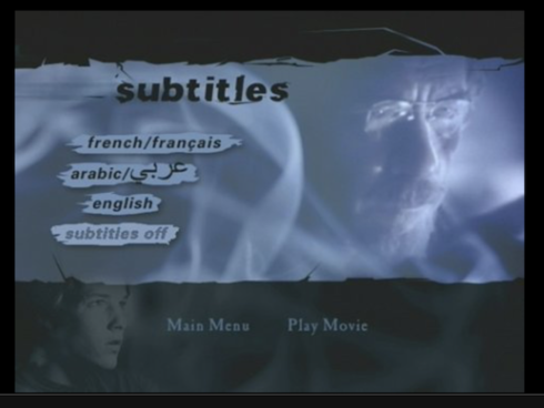
DVD menu pages: Someone with access to French language DVDs has been uploading menu pages. This seems unnecessary. Sometimes you can't even tell what the film is.
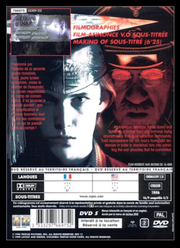
DVD back page: This seems unnecessary. Sometimes you can't even tell what the film is. The quality of these tend to be not good.
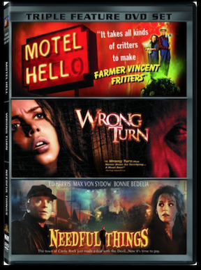
DVD multi-pack ads: This seems unnecessary.
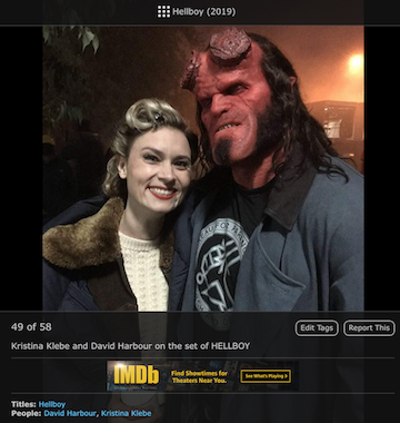
Actor selfies with co-stars: Usually background or kid actors trying to fill out their galleries. However these tend to clutter up the movie gallery. Maybe avoid tagging the film so it's just in their gallery? This tends to happen at the premiere events also.
Sequencing redundant images: Why tell a story in four images when you already told it with one image?

Behind the scenes images that tell you nothing about the film. Usually no actors or directors etc. Can you even tell this is for the new Terminator film?
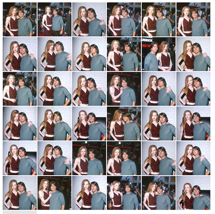
Event photos that are redundant or duplicates: Event photographers need to edit themselves. This is an extreme example. Marvel films tend to put up an excessive amount tof very similar but not duplicate event photos. Also whoever uploads event photos (either the photographer or the studio) needs to make sure they are not uploading duplicates. There are a TON of event duplicates.
Letterbox images: Images that already have the black bars when uploaded tend to make for a crappy looking gallery. The system already formats full frame images with the black bars so these are now double letterboxed.
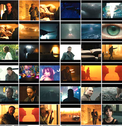
First: contributors who get images from screencap sites need to know that those sites generate dark images. They need to brighten the images to match how they really should look. Without doing so you tend to get a gallery of dark muddy images. Also size matters.
DVD menu pages: Someone with access to French language DVDs has been uploading menu pages. This seems unnecessary. Sometimes you can't even tell what the film is.
DVD back page: This seems unnecessary. Sometimes you can't even tell what the film is. The quality of these tend to be not good.
DVD multi-pack ads: This seems unnecessary.
Actor selfies with co-stars: Usually background or kid actors trying to fill out their galleries. However these tend to clutter up the movie gallery. Maybe avoid tagging the film so it's just in their gallery? This tends to happen at the premiere events also.
Sequencing redundant images: Why tell a story in four images when you already told it with one image?
Behind the scenes images that tell you nothing about the film. Usually no actors or directors etc. Can you even tell this is for the new Terminator film?
Event photos that are redundant or duplicates: Event photographers need to edit themselves. This is an extreme example. Marvel films tend to put up an excessive amount tof very similar but not duplicate event photos. Also whoever uploads event photos (either the photographer or the studio) needs to make sure they are not uploading duplicates. There are a TON of event duplicates.
Letterbox images: Images that already have the black bars when uploaded tend to make for a crappy looking gallery. The system already formats full frame images with the black bars so these are now double letterboxed.


jeorj_euler
10.7K Messages
•
226.4K Points
7 years ago
0
jay_spirit
1.1K Messages
•
31.9K Points
7 years ago
For one thing, it doesn't matter to me that you can't tell from the image what film it's from. That's what the title tag is for. That's why it's in the image gallery for that movie and not another.
I especially like the DVD menus, the back covers for DVDs, and the sequencing images. The pictures are data, and the data is useful. The more data the better.
i'm ambivalent about the large number of similar event photos. Maybe they're too much, but I always favor more data rather than less.
The image galleries are often sloppy, but the fix is to organize them better, not reduce the number of pictures.
0
ben_hampel
511 Messages
•
8.8K Points
7 years ago
0
Marco
3.4K Messages
•
94.3K Points
7 years ago
I feel the DVD multi-pack ads should go. The posters shown here are already on the title's page and the information that a certain title has been multi-packed on DVD can be mentioned in the trivia section for said title.
The selfies with actors don't bother me, except for the fact that quite a bit of them are of low quality. These should be deleted I feel, but not because they are selfies, but because of the lack of quality.
I'm ambivalent about the Sequencing redundant images. They aren't dupes, but they are annoying as hell sometimes. But where does one draw the line? How many picture should remain from your original example? The first and the fourth? Or also the third?I think this has to be dealt with on a case by case basis, but that will always result in people disagreeing with a decision I'm afraid.
When it comes to almost duplicated event photos, I feel IMDb should delete more near-dupes. The example of the pics for Tom Cruise and Nicole Kidman while promoting Eyes Wide Shut is an eye-sore to me.
Hopefully, a staffer will respond to this thread.
(for the record, I don't submit photos to the database, I just correct/edit/delete them)
0
ben_hampel
511 Messages
•
8.8K Points
7 years ago
0
ben_hampel
511 Messages
•
8.8K Points
7 years ago
5