Employee
•
161 Messages
•
5.9K Points
Contribution Experience Update: Responsive CX
Hi,
Today (July 23, 2020) we have made an update to our primary contribution experience (accessible from the <Edit Page> button on all name, title and company pages) to make it work responsively based on your device type.
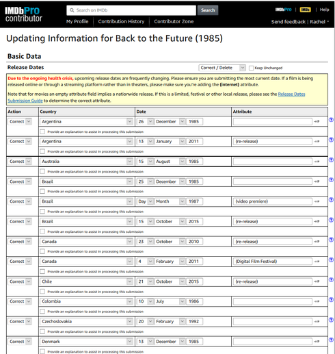
For contributors accessing our contribution interface from desktop, the experience is almost identical. To illustrate, below is a quick link to show the CX for editing all of the release dates for a movie, accessible via this link -> https://contribute.imdb.com/updates?update=tt0088763:release_dates.correct.all
This is what I see on my laptop:-
![]()

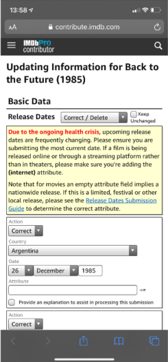
If you click on the same link from a mobile device, the layout of the UI will change based on your device type. Here is the same link as above, accessed from my iPhone:-

All of the underlying functionality is the same, we have just changed the layout to one that is more usable on a mobile device (you no longer have to scroll from left to right to see all of the fields in the table).
We have moved away from the traditional grid, and have laid out each item into it's own component (with hints above the fields to show the labels). In the example above, you can scroll down to see all the release dates for Back to the Future (1985).
The feature is enabled for every data type accessible from name, title and company pages. It is also enabled when adding a new title -> https://contribute.imdb.com/updates?update=title&ref_=gs_newtitle_ra
If you have any questions/feedback, please respond to this thread.
Cheers,
Rachel
Today (July 23, 2020) we have made an update to our primary contribution experience (accessible from the <Edit Page> button on all name, title and company pages) to make it work responsively based on your device type.
For contributors accessing our contribution interface from desktop, the experience is almost identical. To illustrate, below is a quick link to show the CX for editing all of the release dates for a movie, accessible via this link -> https://contribute.imdb.com/updates?update=tt0088763:release_dates.correct.all
This is what I see on my laptop:-
If you click on the same link from a mobile device, the layout of the UI will change based on your device type. Here is the same link as above, accessed from my iPhone:-
All of the underlying functionality is the same, we have just changed the layout to one that is more usable on a mobile device (you no longer have to scroll from left to right to see all of the fields in the table).
We have moved away from the traditional grid, and have laid out each item into it's own component (with hints above the fields to show the labels). In the example above, you can scroll down to see all the release dates for Back to the Future (1985).
The feature is enabled for every data type accessible from name, title and company pages. It is also enabled when adding a new title -> https://contribute.imdb.com/updates?update=title&ref_=gs_newtitle_ra
If you have any questions/feedback, please respond to this thread.
Cheers,
Rachel


adrian
Champion
•
3K Messages
•
72.5K Points
6 years ago
4
adrian
Champion
•
3K Messages
•
72.5K Points
6 years ago
2
thebluetuna
65 Messages
•
1.4K Points
6 years ago
The box alignment is extremely jacked-up which makes it difficult to follow especially when the section is long and the headers aren't on the page anymore. There is also the random thick black line which seems to be a minor cosmetic issue, but may be indicative of another issue.
2
ron3
416 Messages
•
9.8K Points
6 years ago
If you hadn't disabled pinch/zoom, scrolling wouldn't have been a "problem".
Just now seeing this change and find it less useful. See image below, where you could once add a dozen or more credits, now you can only add 4 before scrolling.
1
adrian
Champion
•
3K Messages
•
72.5K Points
6 years ago
0
Rachel
Employee
•
161 Messages
•
5.9K Points
6 years ago
I'm replying here given the amount of feedback provided. Here is an update:-
- "Click to copy existing credits" - This was a bug and unintended, it is now fixed. Please let me know if there are any further issues with this.
- The layout issue described by 'thebluetuna' on Chrome, we are trying to reproduce (and have been unsuccessful so far). We'll keep trying.
- With regards to the feedback on the responsive experience (described by Ron and in a separate thread here -> https://getsatisfaction.com/imdb/topics/recent-site-update-has-corrupted-formatting-of-cast-update-p...), we've listened to the feedback and will disable the responsive feature when we detect you are using desktop. The team are working on that now, I'll need to get back to you with an ETA.
With regards to the points around involving our contributors before making these types of changes. We have been attempting to do that far more this year (as Peter called out), to get early feedback on this type of change. If there are individuals who are interested (beyond the GS champs) in this type of early insight, we are very open to including you.Cheers,
Rachel
11
ACT_1
8.9K Messages
•
180.4K Points
6 years ago
I have made several improvement suggestions for IMDb
Joel, IMDb Customer Service, and others from Help Desk
says that these need to be voted on by GS Members / IMDb Users
They are still waiting for more votes
So, how many voted for Your changes ? ?
.
0
bulmapunkrocker
188 Messages
•
7K Points
6 years ago
I have been using the app on Android during the Covid-19 lockdown, I personally don't like the change on the app for contributions, but I actually don't like the app at all. I can't even go to IMDb Pro on the app. But that's my fault, I should use the laptop.
0
bderoes
Champion
•
5.1K Messages
•
118.7K Points
6 years ago
Chrome 85, Windows 10, 15.6" monitor, window maximized.
Small entry boxes are ending up on a second, unnecessary, line.
This is adding a new title.
This is only 1 example.
Another:
And worst of all, assigning cast order:
(edited)
2
bderoes
Champion
•
5.1K Messages
•
118.7K Points
6 years ago
Rachel -
Any plans to make the desktop version more responsive to window size?
I usually have the window half the size of the desktop, so I can view another window along side.
I find it especially annoying that the menu for selecting data types is so unnecessarily wide, and retains the full width in a small window.
This
must be horizontally scrolled to select the desired option, by which time I might lose sight of where that really is.
0